Tip
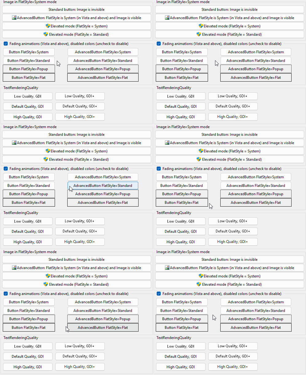
The image above is from the example application.
At the Releases page of the project repository you can download it as executable binaries as well.

[ToolboxBitmapAttribute(typeof(Button))]
public class AdvancedButton : Button,
ISupportsFading<ControlAppearanceState>, IWin32Window<ToolboxBitmapAttribute(GetType(Button))>
Public Class AdvancedButton
Inherits Button
Implements ISupportsFading(Of ControlAppearanceState), IWin32Window[ToolboxBitmapAttribute(typeof(Button))]
public ref class AdvancedButton : public Button,
ISupportsFading<ControlAppearanceState^>, IWin32Window[<ToolboxBitmapAttribute(typeof(Button))>]
type AdvancedButton =
class
inherit Button
interface ISupportsFading<ControlAppearanceState>
interface IWin32Window
endThe following image illustrates a few features of the AdvancedButton class, like displaying an image with System FlatStyle, elevated mode, rendering quality. The animation highlights the buffered animations support for non-System FlatStyles, which is not supported by a regular Button:
| AdvancedButton | Creates a new instance of AdvancedButton. |
| AutoScaleFont |
Gets or sets whether the Font should be automatically scaled when DPI changes and the current thread has per-monitor DPI awareness.
Default value: . |
| AutoSizeMode | Gets or sets the mode by which the AdvancedButton automatically resizes itself. |
| BackColor |
Gets or sets the background color of the control in the current Enabled state.
(Overrides ButtonBaseBackColor) |
| DefaultSize | Gets the default size of the control. (Overrides ButtonBaseDefaultSize) |
| DisabledBackColor | Gets or sets the background color when the control is not Enabled. |
| DisabledForeColor | Gets or sets the text color when the control is not Enabled. |
| EnabledBackColor | Gets or sets the background color when the control is Enabled. |
| EnabledForeColor | Gets or sets the text color when the control is Enabled. |
| FadingAnimationDefaultSpeed |
Gets or sets the default fading animation speed for non-standard animations in milliseconds. Zero value means immediate change.
Default value: 500. |
| FadingAnimationOptions |
Gets or sets the fading options of the control.
Default value: StandardEffects. |
| FadingAnimationsEnabled |
Gets or sets whether fading animations are enabled for the control.
Animations work on Windows Vista and above when rendering with visual styles.
Default value: . |
| FlatStyle |
Gets or sets the flat style appearance of the button control.
Default value: Standard. |
| Font | Gets or sets the font of the text displayed by the control. (Overrides ControlFont) |
| ForeColor |
Gets or sets the foreground color of the control in the current Enabled state.
(Overrides ControlForeColor) |
| Image | Gets or sets the image that is displayed on the button control. |
| IsElevated |
Gets or sets whether an elevated shield icon should be displayed on the button.
Default value: . |
| MaximumSize | Gets or sets the size that is the upper limit that GetPreferredSize(Size) can specify. (Overrides ControlMaximumSize) |
| MinimumSize | Gets or sets the size that is the lower limit that GetPreferredSize(Size) can specify. (Overrides ControlMinimumSize) |
| Text |
Gets or sets the text of the button.
(Overrides ButtonBaseText) |
| TextImageRelation |
Gets or sets the position of text and image relative to each other.
Default value: ImageBeforeText. |
| TextRenderingQuality |
Gets or sets the text rendering quality of the AdvancedButton.
Default value: SystemDefault. |
| UseCompatibleTextRendering |
Gets or sets whether to use the text rendering engine compatible with .NET Framework 1.x (GDI+) or not (GDI).
Default value: . |
| PaintState | Occurs when the control is painted in a specific state. |
| GetFormatFlags |
Gets the formatting flags for the text of a custom drawn control.
(Defined by ControlExtensions) |
| GetScale |
Gets the current scale factor of the specified control. If per-monitor DPI awareness is not enabled, it always returns SystemScale.
(Defined by ScaleHelper) |
| GetScrollBarSize |
Gets the recommended width and height of scrollbars matching the current scaling of the specified control.
(Defined by ScaleHelper) |
| HasDefaultScaling |
Gets whether the display that the specified control belongs to has the same DPI as the initial DPI of the primary display.
(Defined by ScaleHelper) |
| ScaleHeight |
Scales the specified height by the vertical scale factor of the control.
(Defined by ScaleHelper) |
| ScaleSize |
Scales the specified size by the scale factor of the control.
(Defined by ScaleHelper) |
| ScaleWidth |
Scales the specified width by the horizontal scale factor of the control.
(Defined by ScaleHelper) |
| SetControlEnabled |
Sets the Enabled property of the child controls within the specified root control,
or the Enabled property of the specified control itself, if it is not a recognized container control.
By this way pages of a TabControl will remain selectable, a SplitContainer remains resizable, etc.
(Defined by ControlExtensions) |
| SetControlReadonly |
Recursively sets the read-only state in the children of the specified root control.
Affects TextBoxBase and IReadOnlyCapable instances.
(Defined by ControlExtensions) |
| SetDoubleBuffered |
Sets the double buffered state of a control
(Defined by ControlExtensions) |
| SetStyle |
Sets a specified ControlStyles flag to either or .
It calls the protected Control.SetStyle method on the specified control as if it was a public method.
(Defined by ControlExtensions) |