Tip
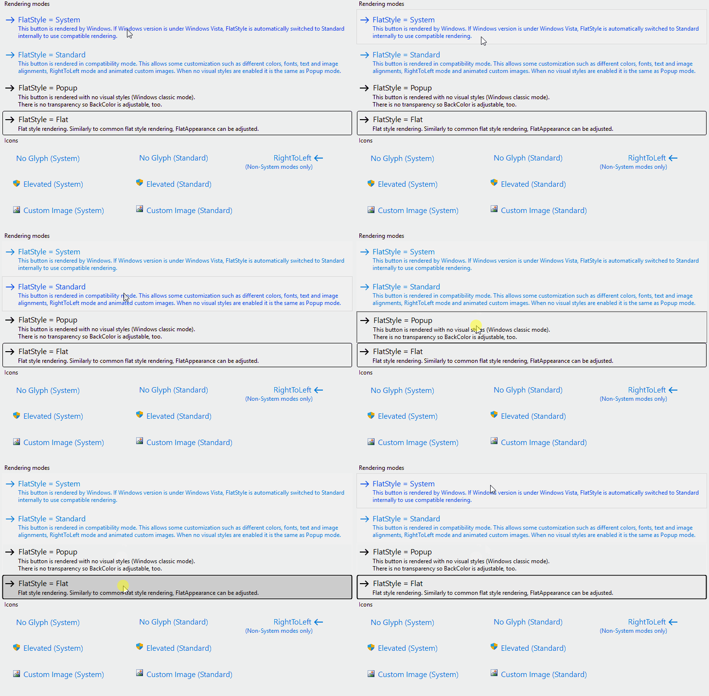
The image above is from the example application.
At the Releases page of the project repository you can download it as executable binaries as well.

[ToolboxBitmapAttribute(typeof(CommandLinkButton), "Resources.Toolbox.CommandLinkButton.png")]
public class CommandLinkButton : Button,
ISupportsFading<ControlAppearanceState>, IWin32Window<ToolboxBitmapAttribute(GetType(CommandLinkButton), "Resources.Toolbox.CommandLinkButton.png")>
Public Class CommandLinkButton
Inherits Button
Implements ISupportsFading(Of ControlAppearanceState), IWin32Window[ToolboxBitmapAttribute(typeof(CommandLinkButton), L"Resources.Toolbox.CommandLinkButton.png")]
public ref class CommandLinkButton : public Button,
ISupportsFading<ControlAppearanceState^>, IWin32Window[<ToolboxBitmapAttribute(typeof(CommandLinkButton), "Resources.Toolbox.CommandLinkButton.png")>]
type CommandLinkButton =
class
inherit Button
interface ISupportsFading<ControlAppearanceState>
interface IWin32Window
endThe following image illustrates a few features of the CommandLinkButton class, like the various FlatStyles, elevated mode, custom image support, and buffered fading animations:
| CommandLinkButton | Creates a new CommandLinkButton instance. |
| AutoEllipsis |
Gets or sets whether the ellipsis character (...) appears at the right edge of the control,
denoting that the control text extends beyond the specified length of the control.
Default value: . |
| AutoScaleFont |
Gets or sets whether Font and DescriptionFont should be automatically scaled when DPI changes and the current thread has per-monitor DPI awareness.
Default value: . |
| AutoSize |
Gets or sets whether the command link button automatically resizes itself to its content.
Default value: . (Overrides ButtonBaseAutoSize) |
| AutoSizeMode |
Gets or sets the mode by which the CommandLinkButton automatically resizes itself.
Default value: GrowAndShrink. |
| BackColor |
Gets or sets the background color of the control in the current Enabled state.
(Overrides ButtonBaseBackColor) |
| CreateParams | Gets a CreateParams on the base class when creating a window. (Overrides ButtonCreateParams) |
| DefaultSize | Gets the default size of the control. (Overrides ButtonBaseDefaultSize) |
| Description | Gets or sets description text for the command link button. |
| DescriptionColor | Gets or sets the description color of the command link button. |
| DescriptionFont | Gets or sets the font of the description displayed by the control. |
| DisabledBackColor | Gets or sets the background color when the control is not Enabled. |
| DisabledForeColor | Gets or sets the text color when the control is not Enabled. |
| EnabledBackColor | Gets or sets the background color when the control is Enabled. |
| EnabledForeColor | Gets or sets the text color when the control is Enabled. |
| FadingAnimationDefaultSpeed |
Gets or sets the default fading animation speed for non-standard animations in milliseconds. Zero value means immediate change.
Default value: 500. |
| FadingAnimationOptions |
Gets or sets the fading options of the control.
Default value: StandardEffects. |
| FadingAnimationsEnabled |
Gets or sets whether fading animations are enabled for the control.
Animations work on Windows Vista and above when rendering with visual styles.
Default value: . |
| FlatStyle |
Gets or sets the flat style state of the command link button.
Default value: Standard. |
| Font |
Gets or sets the font of the text displayed by the control.
(Overrides ControlFont) |
| ForeColor |
Gets or sets the foreground color of the control in the current Enabled state.
(Overrides ControlForeColor) |
| HighlightDescriptionColor | Gets or sets the highlighted description color of the command link button. |
| HighlightTextColor | Gets or sets the highlighted text color of the command link button. |
| Image | Gets or sets the image that is displayed on the command link button control. |
| ImageAlign |
Gets or sets the alignment of the image on the command link button control. A Top alignment attempts to align the image to the middle of the first row of Text.
Default value: TopLeft. |
| IsElevated |
Gets or sets whether an elevated shield icon should be displayed on the command link button.
Default value: . |
| PressedDescriptionColor | Gets or sets the pressed description color of the command link button. |
| PressedTextColor | Gets or sets the pressed text color of the command link button. |
| Text |
Gets or sets text of the command link button.
(Overrides ButtonBaseText) |
| TextAlign |
Gets or sets the alignment of the text on the command link button control.
(Overrides ButtonBaseTextAlign) |
| TextRenderingQuality |
Gets or sets the text rendering quality of the CommandLinkButton.
Default value: SystemDefault. |
| UseCompatibleTextRendering |
Gets or sets whether to use the text rendering engine compatible with .NET Framework 1.x (GDI+) or not (GDI).
Default value: . |
| UseDefaultGlyph |
Gets or sets whether the default arrow glyph should be displayed.
Default value: . |
| VisualsRenderingQuality |
Gets or sets the rendering quality of the CommandLinkButton visuals.
Default value: High. |
| PaintState | Occurs when the control is painted in a specific state. |
| GetFormatFlags |
Gets the formatting flags for the text of a custom drawn control.
(Defined by ControlExtensions) |
| GetScale |
Gets the current scale factor of the specified control. If per-monitor DPI awareness is not enabled, it always returns SystemScale.
(Defined by ScaleHelper) |
| GetScrollBarSize |
Gets the recommended width and height of scrollbars matching the current scaling of the specified control.
(Defined by ScaleHelper) |
| HasDefaultScaling |
Gets whether the display that the specified control belongs to has the same DPI as the initial DPI of the primary display.
(Defined by ScaleHelper) |
| ScaleHeight |
Scales the specified height by the vertical scale factor of the control.
(Defined by ScaleHelper) |
| ScaleSize |
Scales the specified size by the scale factor of the control.
(Defined by ScaleHelper) |
| ScaleWidth |
Scales the specified width by the horizontal scale factor of the control.
(Defined by ScaleHelper) |
| SetControlEnabled |
Sets the Enabled property of the child controls within the specified root control,
or the Enabled property of the specified control itself, if it is not a recognized container control.
By this way pages of a TabControl will remain selectable, a SplitContainer remains resizable, etc.
(Defined by ControlExtensions) |
| SetControlReadonly |
Recursively sets the read-only state in the children of the specified root control.
Affects TextBoxBase and IReadOnlyCapable instances.
(Defined by ControlExtensions) |
| SetDoubleBuffered |
Sets the double buffered state of a control
(Defined by ControlExtensions) |
| SetStyle |
Sets a specified ControlStyles flag to either or .
It calls the protected Control.SetStyle method on the specified control as if it was a public method.
(Defined by ControlExtensions) |